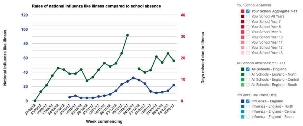
- National Influenza Like Illness: The number of individuals across England and Wales going to see their General Practitioner with Influenza Like Illness (per 100,000 of the population). This is data collected by the Royal College of General Practitioners (RCGP) and is one of the best indicators for flu activity (read more about it here).
- Days missed due to illness: National school data showing the number of days missed due to illness (per 100 students).
WARNING – Please read the following about the data on this graph:
The graph you’re looking at is a live summary of the data we’re collecting. We are making this information available publicly as we want to open up research to the public, showing it in a new and exciting way. However, this is research project, which means we don’t yet know what the data is telling us, we’re still deciphering that.
Because of this you need to be very cautious when looking at the graph. If there’s a blip or a dip in the data, it could be real, it could be an error, or it could be caused by something completely unrelated to flu. Therefore, please don’t use the graph to try and work out whether there is an outbreak of influenza occurring. If you want to know what’s going on with the levels of flu in England and Wales then you should check Health Protection Agency reports here.
XY Scatter graph
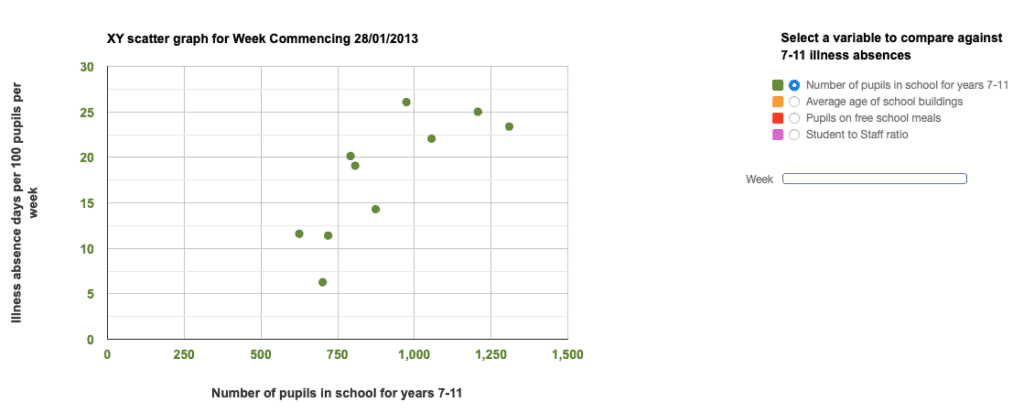
Analysis:
- Week: You can analyse any week. We recommend looking at the week with the biggest peak in national school absence so far, as this will indicate whether an increase in school absence data (and perhaps flu) correlates to key variables, such as age of school buildings. Note: The time trend analysis graph shows that school absence and national flu haven’t peaked yet.
- Data quality: If there are less than 5 data points, we recommend you don’t analyse the scatter graph, as the data quality is low.
- Correlations: Can you spot any correlations between the variables and the school absence data, if so, how good is the correlation? Read more about Analysing the Data in Lesson Plan Two.
- Anomalies: Can you spot any anomalies in the data? If you think there might be something strange going on, Ask the Scientists and Dr Rob will get back to you with his thoughts.
- LabLogs: Teachers and students can record observations, explanations and comments on the quality of data in the LabLog. These will help with writing the school report at the end of the project. (Coming shortly)
- Teacher Perspectives: Read a teacher’s Impression of XY Scatter graph analysis.
WARNING – Please read the following about the data on this graph:
The XY scatter graph you’re looking at is a live summary of the data we’re collecting. We are making this information available only to teachers and students with Flu! accounts. As this is a research project, we don’t yet know what the data is telling us, we’re still deciphering that. Because of this you need to be very cautious when looking at the graph.